.png)
Context
About Art ImmHERsive
This project grew out of teaching an undergraduate course on Mythology and Folklore at UT Austin. Working with students sparked a deeper question for me: how could Augmented Reality reshape the way people encounter folklore, particularly stories about women that often get flattened or erased in popular retellings?
The research and design process documented here centers on one question: how might we help users engage with women's folklore through immersive experiences?
Problem
Problem statement
How might we create an intuitive AR experience that enhances learning and engagement with women's folklore?
Process
Project roadmap
This project required tightly integrating three layers of work: content research, application design, and 3D rendering of physical space. All layers were crucial for designing a single exhibit experience. To keep these threads aligned, I employed an agile design methodology. The iterative process let our team test, refine, and realign at every phase, which was essential given how interdependent the layers were.
.png)
Phase 1
Generative research
Competitive research — what works and what doesn't?
I conducted competitor analysis to map common strengths, gaps, and unexplored opportunities across the immersive exhibit landscape. The synthesis surfaced industry standards we could build on and, more importantly, opportunities that remain untapped.
Ideas to consider: cultural exposure · no walking required · predictable timeframe · accessible design · token collection for learning · sensors that react to presence.
Ideas to avoid: difficulty in wayfinding · stationary experience · limited seating · no interaction without VR gear · limited shared experiences · lack of cultural context.
Opportunity spaces: comprehensible information architecture · choose-your-own-adventure pacing · inclusive physical and digital spaces · no restrictive equipment required · cultural celebration.
The throughline that emerged: Art ImmHERsive's emphasis on cultural education could be its core differentiator, while its focus on global folklore would make it memorable and deepen community engagement.

Screener survey — who visits immersive experiences?
The screener revealed visitors span a wide range of ages and backgrounds. Three primary user groups emerged: young professionals, parents with children, and adults over 50. Given our 10-week timeline, we focused on young professionals and parents with children.


In-depth interviews (n=9)
I conducted nine interviews with participants across age and life stage. Four findings shaped the design direction:
Takeaway 1
Print over digital wayfinding
Visual and readable cues were easier to follow than digital maps, especially for older adults and children. We designed print materials and a phone-based map that lets users trace and check off their path.
Takeaway 2
Audio on demand, not on a loop
Exhibits should alternate text-heavy and audio-heavy stations, each under 15 minutes, with no wait between segments and skip options throughout.
Takeaway 3
Sensory pull for younger users
Kids and young adults are drawn to spectacle and interactivity. Parents prioritized age-appropriateness and whether the experience could hold their kids' attention.
Takeaway 4
Freedom over rigid flow
Seven of nine participants spoke positively about getting lost — but that freedom only works when navigation is easy and essentials (food, restrooms, a directory) are clearly findable.
User profiles
The screener and interview findings consolidated into clear pain points and needs across our two priority groups, which directly informed downstream design decisions.


User journeys
By mapping each persona's journey through the exhibit, we could see where physical space, the application, and interpersonal interactions intersected — and design intentionally for those touchpoints.


Brand
Brand identity
Content & visuals
My conception of Art ImmHERsive was inspired by stories of strong women from across the world. I started with A Thousand and One Nights — short stories that span South Asia, China, and the Middle East — precisely because of how it has been misunderstood in popular culture.
The visual language drew from a spectrum of art traditions: modernist and abstract art, line art, miniatures, geometric patterns, and Mughal architecture. The color palette honors the rich jewel tones that are hallmarks of Islamic art and architecture.
.png)
Moodboards
Because the project was so visually driven, brand exploration was non-negotiable. I compiled themes, color palettes, and reference visuals across four directions: futurism, minimalism, historical, and children's storybooks.


Physical space
For the physical space, I researched Islamic architecture to ground the aesthetic in cultural authenticity. Based on content research, my team calculated foot traffic at the Austin Public Library and sketched rooms with various information layouts. These sketches were then translated into AutoCAD renderings.
.png)
Phase 2
Mobile app ideation
Sketches and wireframes
We started with a Crazy 8s exercise as a team to align on key features: learning about the exhibit, reserving tickets, accessing audio guides, using the AR camera, scanning QR codes, navigating with a wayfinder, and saving favorite items.
.png)
My guiding principle while sketching: give users quick, easy access to features without distracting from the immersive experience itself. That tension drove the final layout, which uses a bottom navigation bar with icons for the most-used features. The tidied lo-fi wireframes are below.

.png)
Lo-fi
Prototyping & usability testing
Information architecture
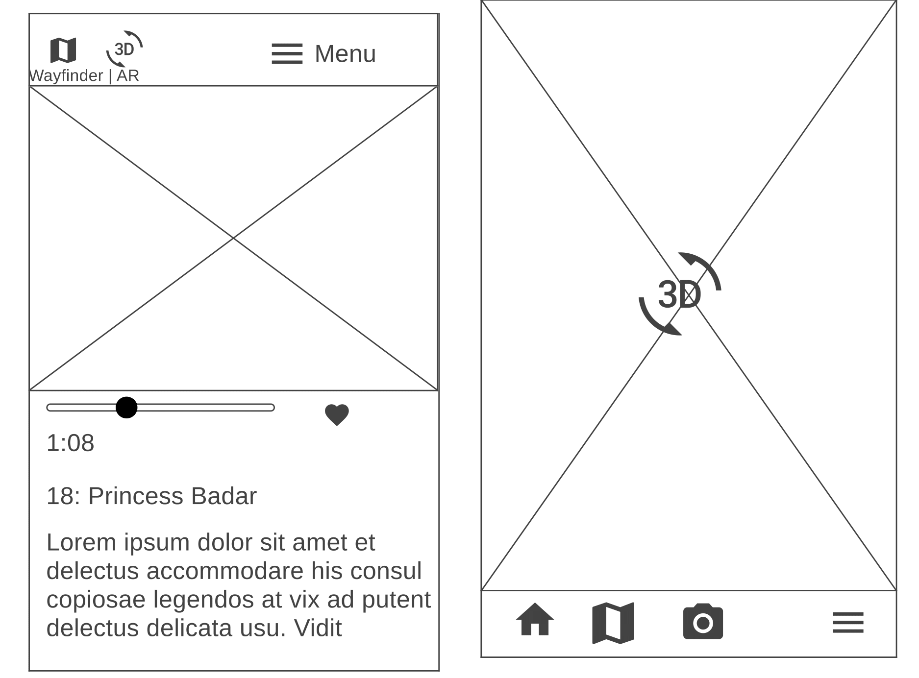
I mapped our information architecture to make sure every flow held together end-to-end. Proposed key task flows included: learning about the production house, finding an exhibit in your city, booking tickets, accessing the map, listening to the audio guide, learning about the AR game, opening the AR camera to see hidden story items, saving items to a collection, scanning QR codes, and finding collected items.

.gif)
Lo-fi usability testing
To pressure-test the layered information architecture, we ran short tasks to see whether users could navigate the main flows without friction:
Task 1: Find the One Thousand and One Nights event you've scheduled.
Task 2: Listen to the audio version of Chapter 1.
Task 3: Collect the gold lamp's AR token.
Method: Lo-fi, hand-drawn sketches transposed into Figma screens, tested via in-person and Zoom moderated think-aloud with 5 testers — young professionals, grad students, and older adults.
Lo-fi findings & recommendations
Takeaway 1
Nomenclature
Page names like Art, Explore, and My Library confused users. They couldn't predict what they'd find behind those labels, which broke first-pass information seeking.
Takeaway 2
Navigability
The hamburger menu needed reworking — both in what it included and how it was ordered. Users struggled to locate the Princess Badr exhibit because it wasn't clear whether to look under Exhibits, My Events, or My Master Library.
Takeaway 3
Core functionality
Some users couldn't pin down what the app was — an e-reader? a booking site? reference material? the AR game? We narrowed the focus: less booking and e-reading, more contextual information and the AR game.
Hi-fi
High-fidelity prototyping & testing
Hi-fi prototyping
We simplified the information architecture for the hi-fi to surface key flows more clearly. I overhauled the app's navigability, added micro-interactions, and implemented a design system. I also led the content research, visual design, and AR game flow — drawing directly on my training in literature and folklore for the storytelling layer.
Hi-fi mobile prototype walkthrough
Hi-fi usability testing
For the final round, I used the Wizard of Oz technique to simulate the 1,001 Nights exhibit, using themed décor, paintings, and signage set up in the physical space. Then I ran usability sessions with 7 participants. Tasks tested:
Task 1: Open the app, create an account, then check whether your friend or child could enter the physical space in a wheelchair.
Task 2: Find the 1,001 Nights collection, locate Exhibit 1: The Story of Princess Badr, and save it.
Task 3: Look up Princess Badr's relationship to 1,001 Nights.
Task 4: Scan the QR code, navigate to Chapter 4's audio guide, and favorite it.
Task 5: Find out how to play the AR game for this exhibit.
Task 6: Start the AR game, open the camera to see what the magic keys reveal, save the token, and view your collection.
Method: Hi-fi mobile app prototype in Figma, tested via Zoom-based moderated think-aloud across 6 sessions with 7 people, ranging widely in career and age (14 to 67).
Hi-fi findings & recommendations
Takeaway 1
Information architecture
Users had trouble locating accessibility info and the audio guide. The root cause: a specific exhibit's information was nested inside the broader app, which supports many exhibits.
Takeaway 2
Comprehension
The relationship between Princess Badr's story and the overarching One Thousand and One Nights collection wasn't clear to all users.
Takeaway 3
AR game
Users surfaced minor mechanical issues (e.g., capturing an AR token) and offered suggestions for the incentive structure.
Hi-fi SUS results
After testing, I administered a System Usability Scale questionnaire to quantify the experience.
.png)
Implementation
The AR game & immersive exhibit
You can play my AR game by clicking the prototype below, and watch my team's rendition of A Thousand and One Arabian Nights in the embedded video.
.png)
Reflection
What I learned
Takeaway 1
Accessibility
Seamlessly integrating exhibit and app design demands constant attention to accessibility — especially around sensory load.
Takeaway 2
Navigability
Information architecture is the backbone of complex experiences. It has to hold up across content strategy, physical design, and app design simultaneously.
Takeaway 3
Cultural context
Designing for diverse audiences means giving enough cultural grounding to honor the material — without tipping into information overload.